About a month ago, while I was flipping through new trending movies to watch on Netflix, I stumbled upon this gorgeous movie cover that said “Chasing Coral”, with these radiant coral reefs on the bottom. As a designer myself, I am often attracted to beautiful images, people and things – this movie poster definitely did a fantastic job of pulling me into checking out what this movie is all about.
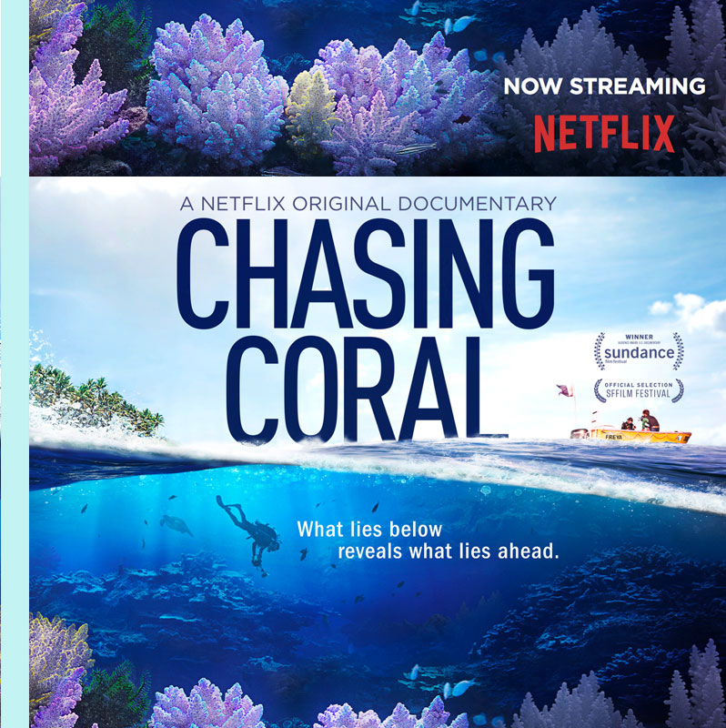
The movie title and poster speak for itself; it is indeed a documentary about coral; specifically, the dying of coral reefs. Over the past few years, I have heard about the bleaching event of Coral Reefs, but never quite understood or cared enough to dig deeper into the topic.
Long before I declared my major in Fashion Design at Parsons, I knew I was very much interested in nature, and wanted to devote my career to designing meaningful sustainable products that will benefit the world. In the past 7+ years, my working relationships with various types of companies that design and sell products had reassured my deep belief in sustainable designs. One of the most inspiring times I had was working with Yeohlee Teng in New York City, who after 30 years, still devotes her high fashion business to sustainable fashion that is classy yet consequential. Interested to learn more about Yeohlee? Check out her company website .
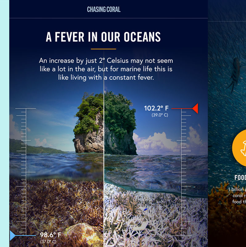
For those of you who don’t know, coral bleaching is a natural reaction to, and warning sign for the changing temperature of the ocean.
What are the causes of this temperature change? As part of the ecosystem, our day-to-day behaviors have the most influence on how the environment changes and develops over time. The waste every single one of us produces and contributes to producing is one of the main causes of climate change.
Here I have gathered 5 hard facts about this bleaching event:
1// Corals are animals who breathe and eat, just like us
2// The coral reefs house vast amounts of ocean life
3// Rising ocean temperatures due to climate change
4// The bleaching event is happening to more than 80% of reefs nationwide
5// The impact is enormous on both ocean and human life
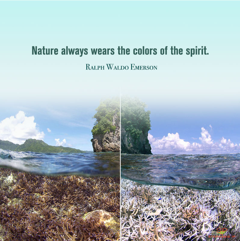
The quote by Ralph Waldo Emerson says it right, “Nature always wears the colors of the spirit.” You wouldn’t eat a fruit that has become an unfamiliar color, because you know it has turned bad. But will you turn to yourself when you see how our Mother Nature is displaying signs of sickness?
The message I’m trying to bring across is very simple – be aware, be considerate, and question yourself before making any decisions about the things you choose to consume daily.
So what does this movie have to do with fashion?
Let’s step back to think for a second. Did you know that all the bright and neon colors that are printed on the clothes we wear are toxic to the environment?
Here are 3 main reasons why everyone of us are responsible:
1// We are part of the ecosystem of this planet
2// Nature cannot keep up with, or recover quickly enough, from the speed of human-generated pollution
3// Human beings are over consuming what nature can provide.
The industrial revolution for sure accelerated industrial production processes and produced more jobs for decades. At the same time, it had also increased the basic needs
Available on Etsy.
Working in the industry of fashion gave me the opportunity to witness how polluting the production process can be. I have to be honest – low quality, mass produced products that are sold in the market today absolutely turn me off. As part of being a product-based business owner myself, I think we really should fuse sustainability actions into our design and development process. As a smart consumer, one should be mindful that deciding to purchase cheap clothing and/or products whose creation generates mass pollution can have massive impacts to the environment we live in.
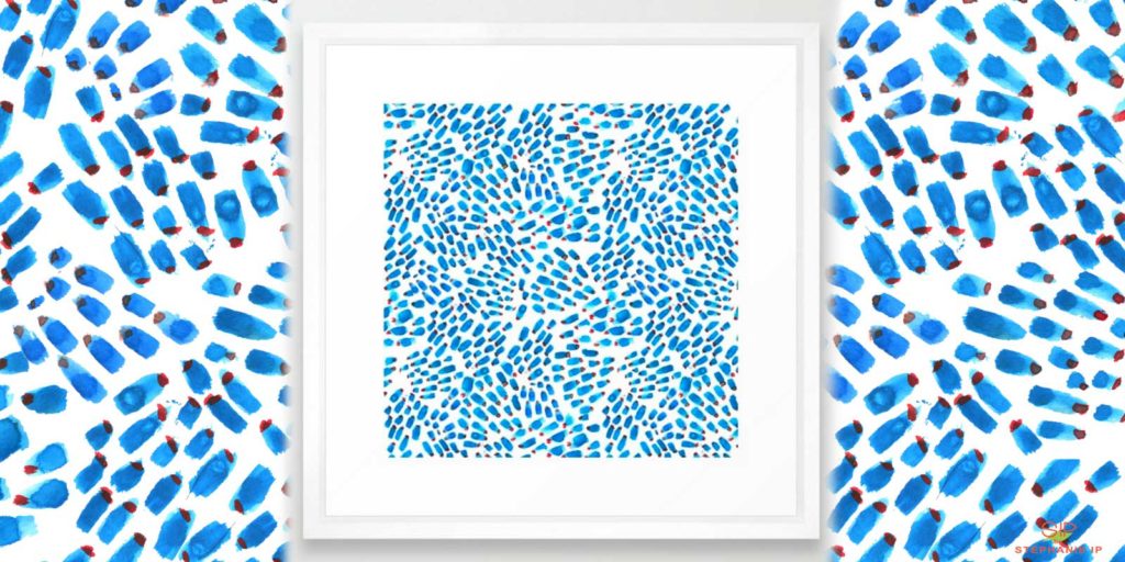
Available on Society6.
In an effort to educate and spread awareness on climate change and saving our coral reef ecosystems that are in serious trouble, a month ago, I had posted a week’s worth of #Awareness posts on my Instagram, which you can check out @SIPbyStephanieIp, or click here.
Contact us
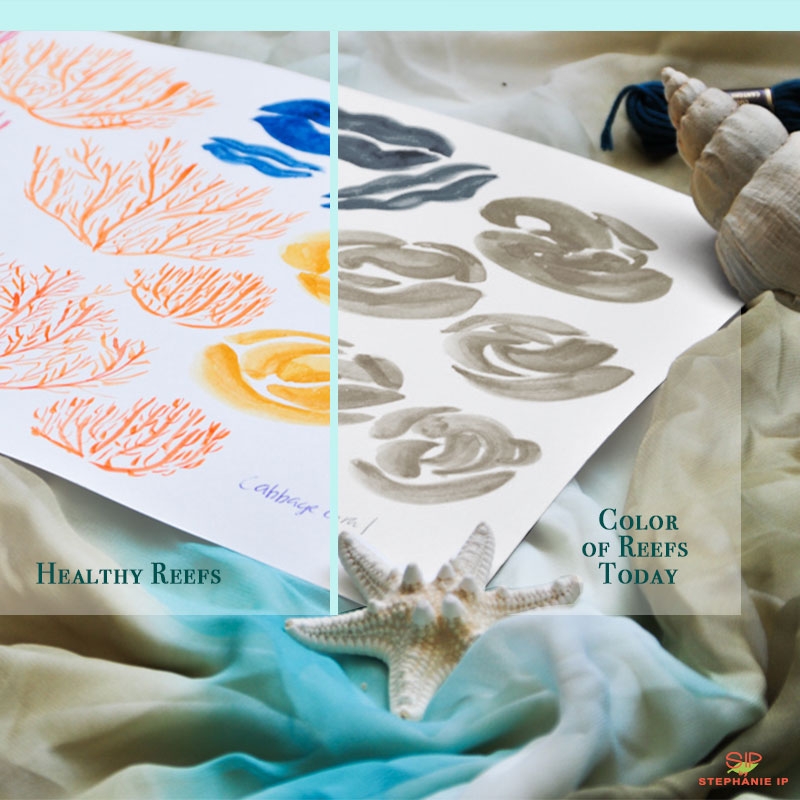
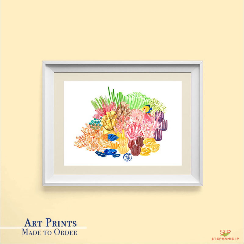
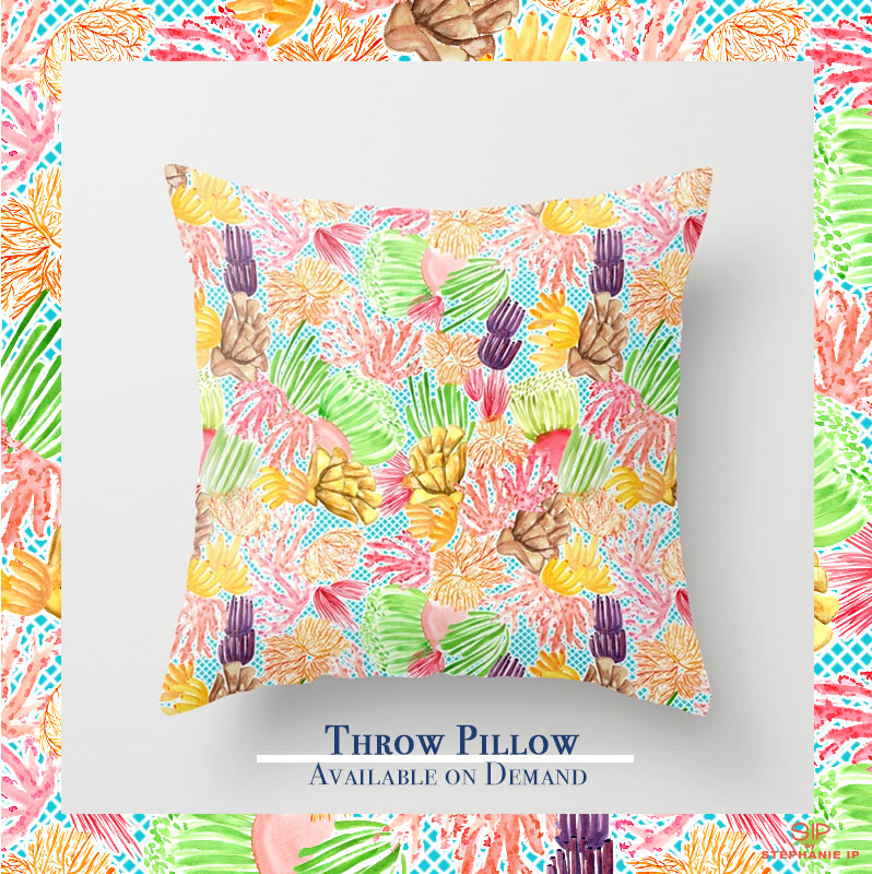
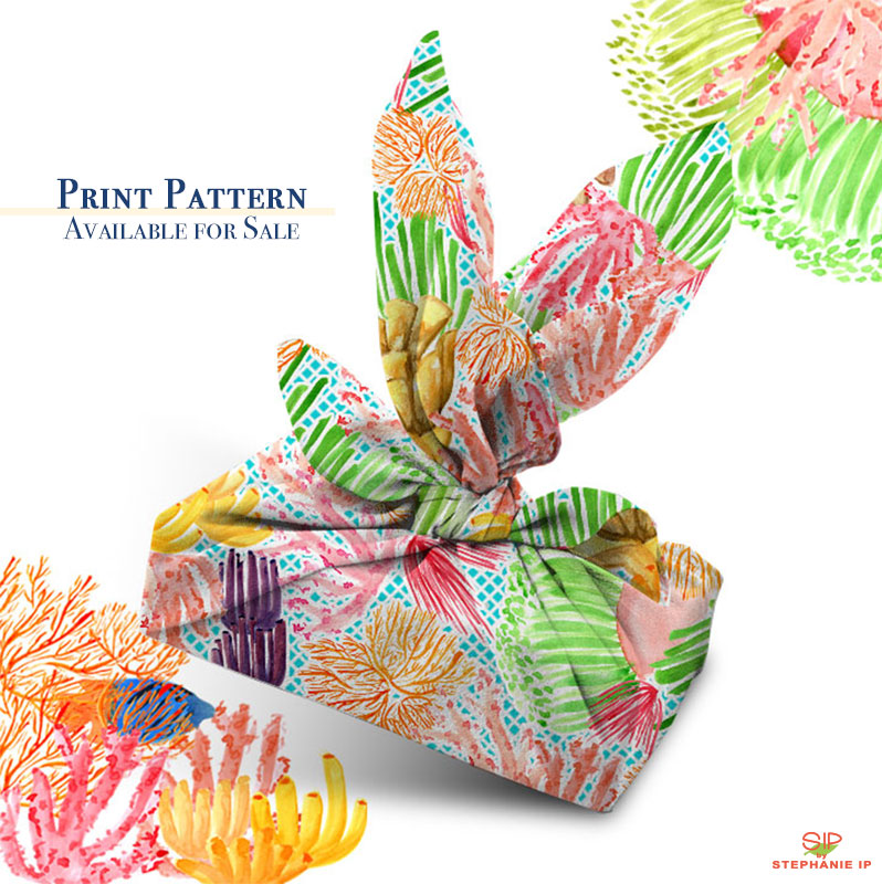
My goal for the weeklong awareness posts is to bring out a message through my artwork, created using my artistic and technical skills in illustration and textile design. As part of my business practice of sustainability, all art prints and printed merchandise are print on demand only. Textile prints are ready made and available for sale upon request. Best of all, partial proceeds will go toward the WILD Foundation to fund all research and promotion on all matters related to animal extinction caused by climate change. Check out the WILD Foundation to learn more.
So what else can you do to help?
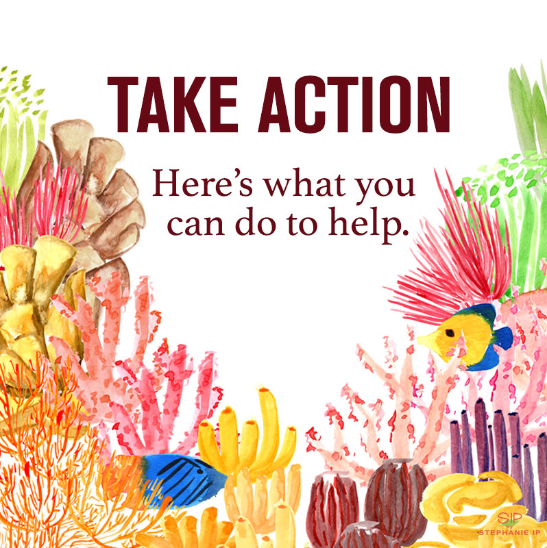
You don’t need to paint or draw! Here are a few simple things you can do today.
1// Watch the fabulous Chasing Coral documentary on Netflix with 5 of your friends or family members whom you care about!
2// Check out ChasingCoral.com. The amazing team have put together some positive actions you can take to help spread the word!
3// Like and share my Instagram posts within your network to spread the #awareness!
// Stephanie Ip

Stephanie is a Creative Director and Consultant, providing creative strategy development support to small and large scale businesses in the industries of Fashion and Soft Goods. She specializes in Design and Development. Learn more about her here.
More Posts | Facebook | Instagram | LinkedIn

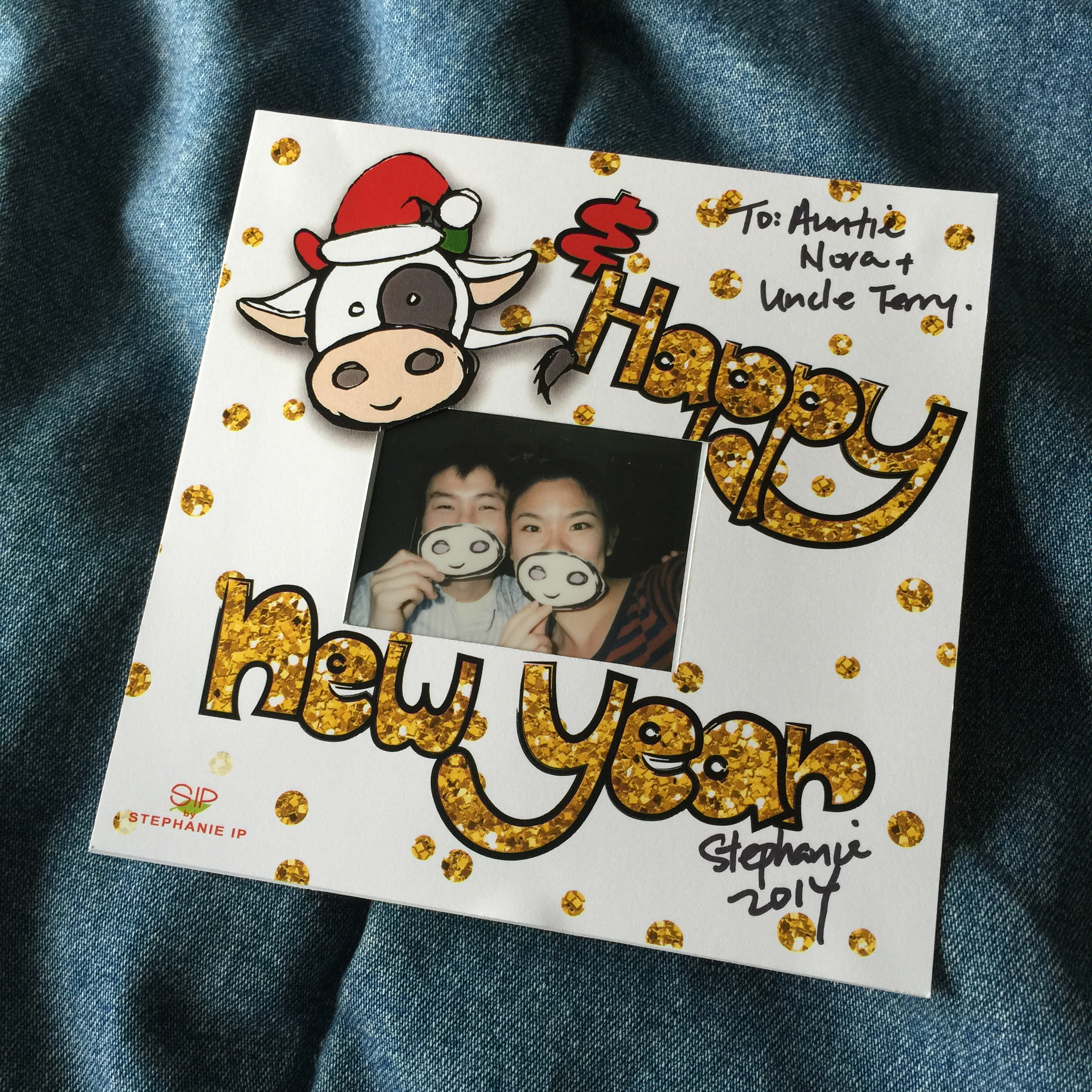
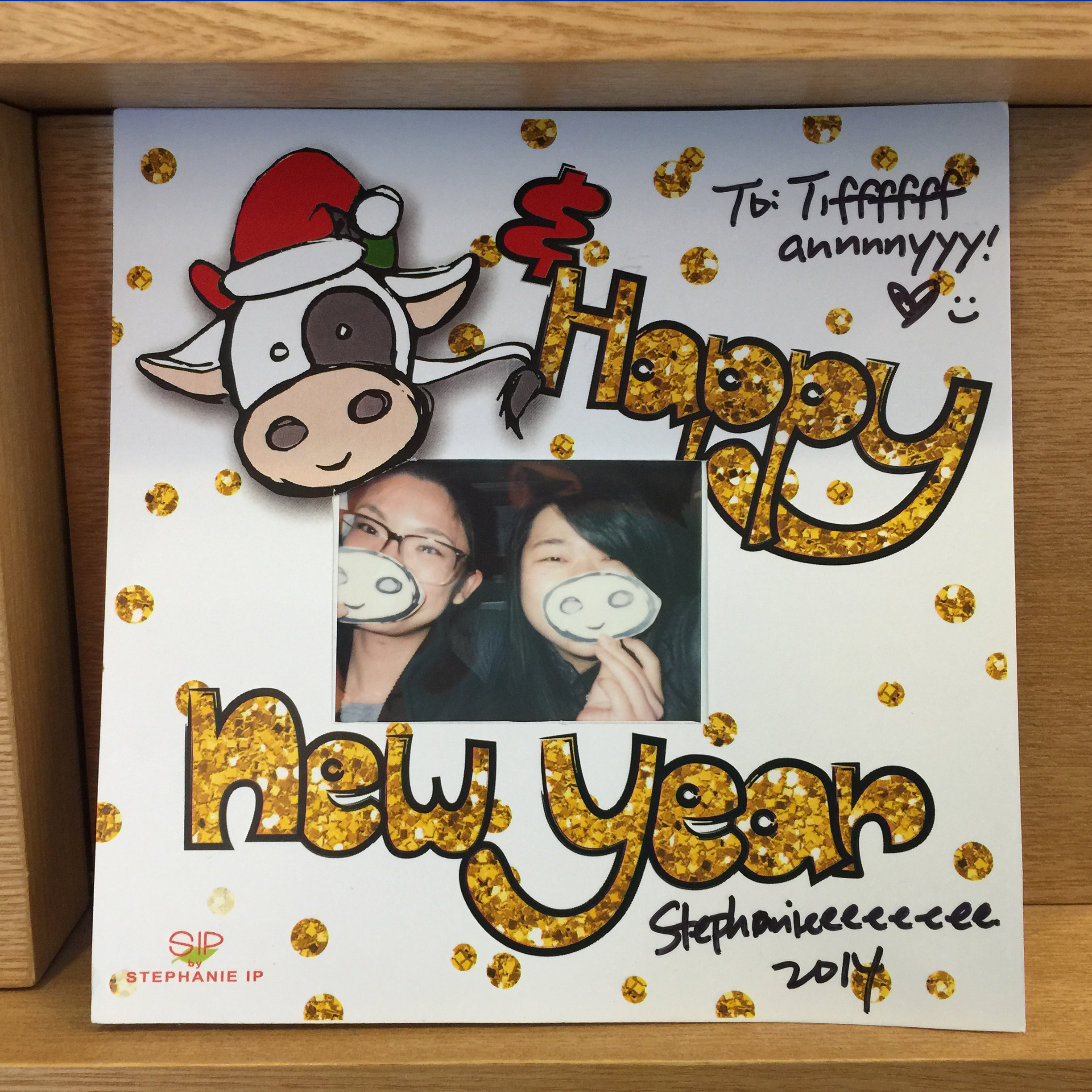
 Happy 2017! I hope your year is off to a great start!
 Products: Tote, zipper pouch
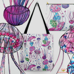
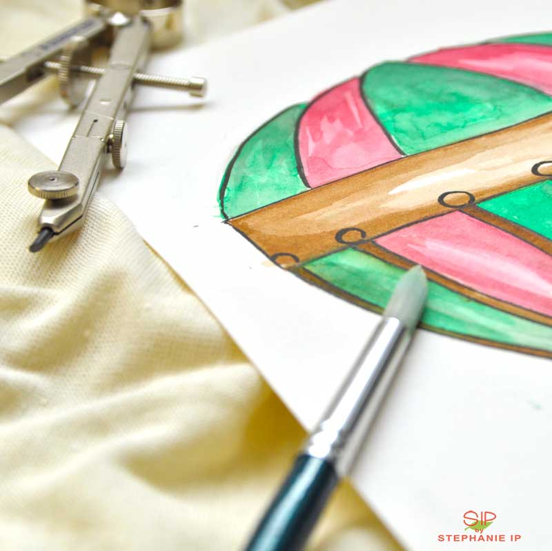
 Graphic Manipulation: Watercolor
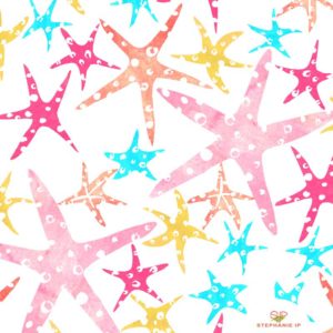

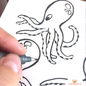 Graphic Manipulation: Adobe Photoshop + Illustrator
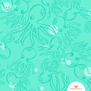
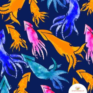
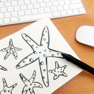
 Medium: Watercolor
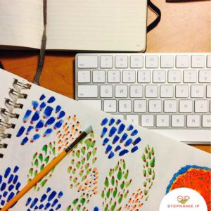 Graphic Manipulation: Adobe Photoshop + Illustrator
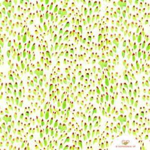 Graphic Manipulation: Adobe Photoshop + Illustrator
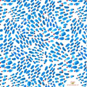
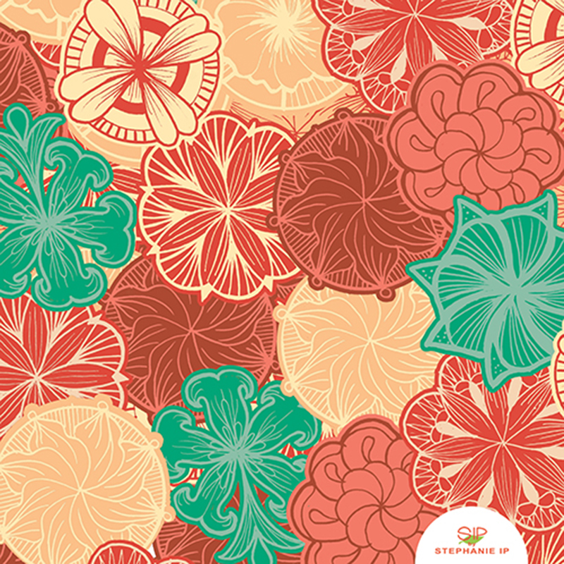
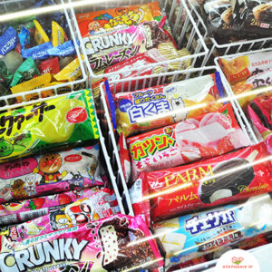
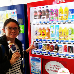
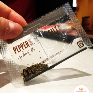
 Ever since I was a little girl, I have found the Japanese culture interesting and unique. It was not until my Mom told me that I hold 1/16 of Japanese blood in me, then I realized my appreciation of Japanese art and culture makes perfect sense.
 (Left) Match green tea ice cream sandwich with pancake
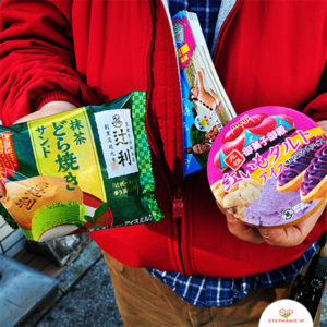

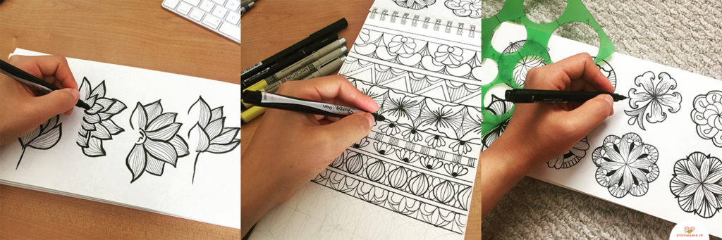 Graphic Manipulation: Adobe Photoshop + Illustrator
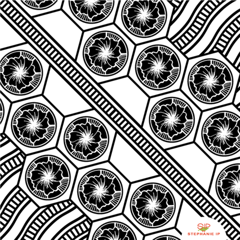 Graphic Manipulation: Adobe Photoshop + Illustrator
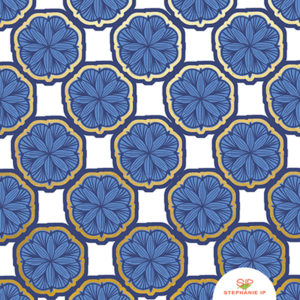 Graphic Manipulation: Adobe Photoshop + Illustrator
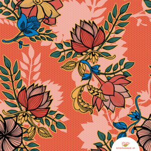 Graphic Manipulation: Adobe Photoshop + Illustrator
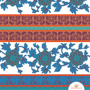
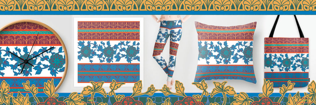
 Products: iPhone case, leggings, rectangular pillow, zipper pouch set